


brand project
Last Summer's Day
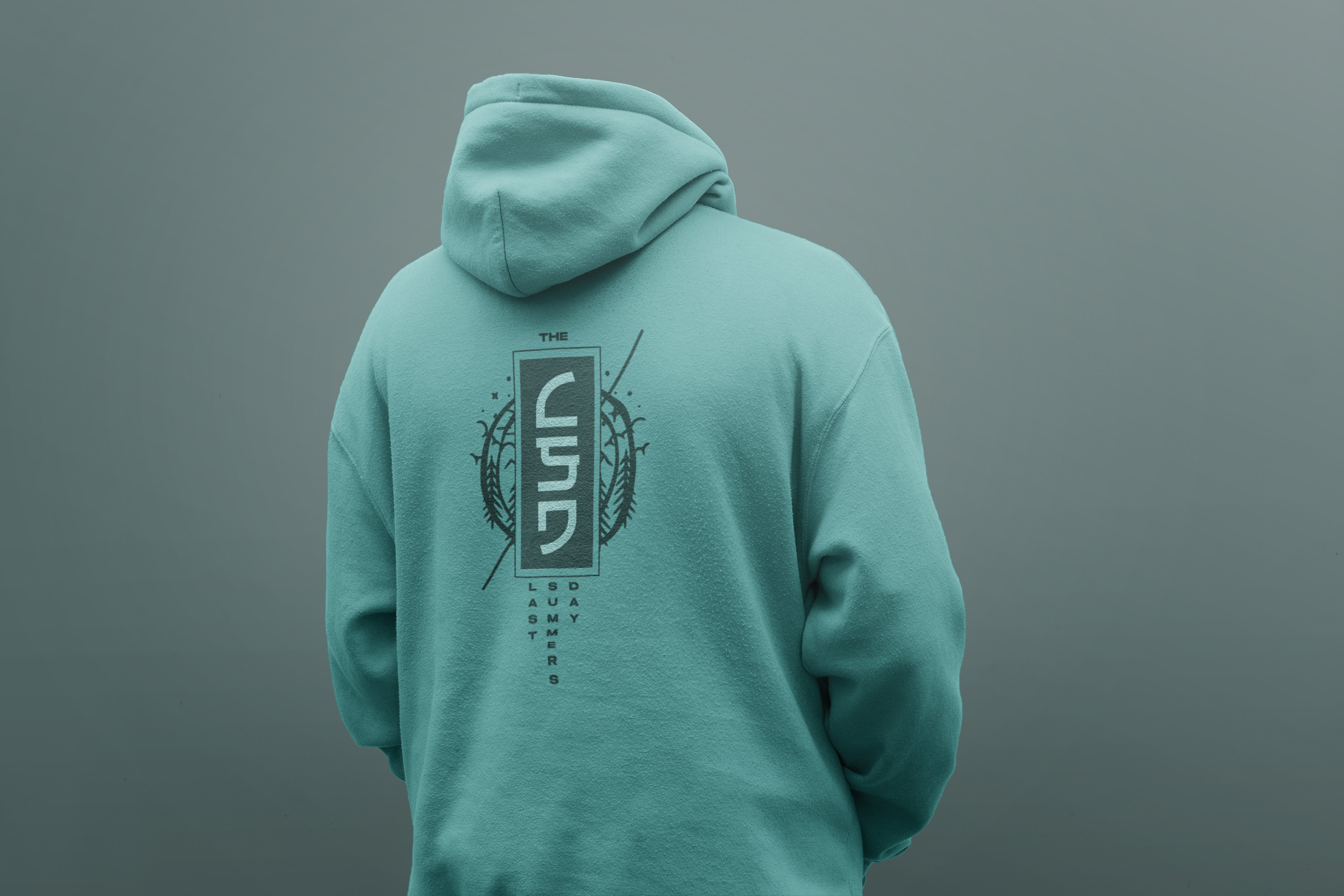

For Last Summer's Day, I crafted a visual identity that captures the essence of a weekend-long celebration of the final summer moments. The open-air venue and vibrant atmosphere, with elements that evoke the warm, sun-soaked feeling of live performances ranging from upbeat indie bands to soulful DJs. My work aimed to visually represent the spirit of a sun-drenched farewell, bringing cohesion to the festival’s promotional materials.

logo design
"Sun no more" A symbol of summer ending. Something so memorable and so simple you can carve it into trees or draw on a dusty windshield evoking summer vibes with just a few strokes.
message
I incorporated a crossed circle symbol into the visual identity to convey a message promoting a focus on enjoying a good time responsibly. This symbol was effectively integrated across promotional materials reinforcing the idea of a clean, positive environment.
advertising
With a focus on simplicity and clear calls to action. The promotional materials I designed featured clean layouts, bold imagery, and concise messaging that evoked intrigue to know more about the event.

As the daylight fades, a spectacular fireworks display lights up the night sky, marking the transition from summer to autumn. It’s a moment to savor, celebrating warmth, light, and togetherness—capturing the spirit of summer one last time before the days grow shorter.
